/* Landing page (docs/index.html) — layers on shared.css + presentation/presentation.css */
/* ── Hero image slot ──
Placeholder until the designed hero lands in assets/hero.png (2560×1280).
When the image arrives: replace .hero-art contents with
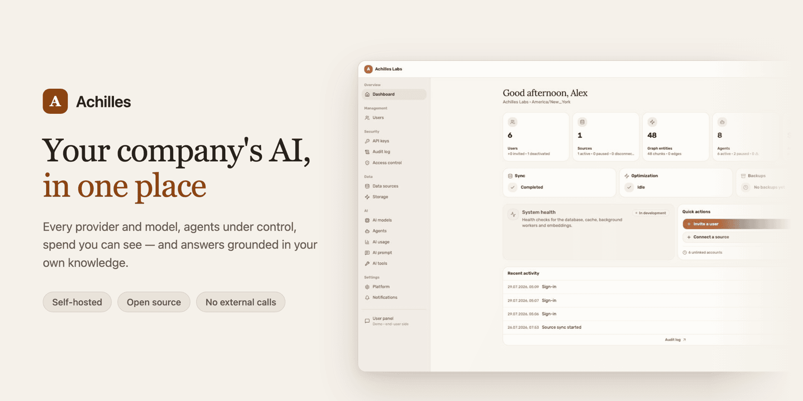 — the rule below sizes it. */
.hero-art {
margin: 0 auto 2.5rem;
max-width: 640px;
}
.hero-art img {
display: block;
width: 100%;
height: auto;
border-radius: var(--radius);
border: 1px solid var(--border);
box-shadow: var(--card-shadow);
}
/* ── Hub scheme ── */
.hub-vis {
display: block;
width: 100%;
max-width: 560px;
margin: 2rem auto 0.5rem;
}
/* ── Navigation cards ── */
.nav-cards {
display: grid;
grid-template-columns: repeat(2, 1fr);
gap: 0.85rem;
margin: 2rem 0 1rem;
}
.nav-card {
display: block;
text-decoration: none;
color: inherit;
padding: 1.2rem 1.35rem;
background: var(--surface);
border: 1.5px solid var(--border);
border-radius: var(--radius);
box-shadow: var(--card-shadow);
transition:
transform 0.15s,
box-shadow 0.15s,
border-color 0.15s;
}
.nav-card:hover {
transform: translateY(var(--link-hover-lift));
box-shadow: var(--link-shadow-hover);
border-color: var(--accent);
}
.nav-card__kicker {
font-family: var(--mono);
font-size: 0.62rem;
font-weight: 700;
text-transform: uppercase;
letter-spacing: 0.08em;
color: var(--accent);
margin-bottom: 0.35rem;
}
.nav-card__title {
font-size: 1.05rem;
font-weight: 700;
letter-spacing: var(--heading-spacing);
margin-bottom: 0.3rem;
}
.nav-card__text {
font-size: 0.82rem;
color: var(--text-dim);
line-height: 1.5;
}
.nav-card__arrow {
font-family: var(--mono);
font-size: 0.78rem;
font-weight: 700;
color: var(--accent);
margin-top: 0.55rem;
}
/* ── Pillars (two-line what-it-is strip) ── */
.pillars {
display: grid;
grid-template-columns: repeat(2, 1fr);
gap: 0.85rem;
margin: 2rem 0 0.5rem;
}
.pillar {
padding: 1.1rem 1.25rem;
background: var(--surface);
border: 1px solid var(--border);
border-radius: var(--radius);
}
.pillar__title {
font-size: 0.92rem;
font-weight: 700;
margin-bottom: 0.3rem;
}
.pillar__text {
font-size: 0.84rem;
color: var(--text-dim);
line-height: 1.55;
}
/* ── Footer meta ── */
.meta-line {
text-align: center;
font-family: var(--mono);
font-size: 0.72rem;
color: var(--text-muted);
margin-top: 2rem;
}
.meta-line a {
color: var(--text-dim);
text-decoration: none;
border-bottom: 1px solid var(--border);
}
.meta-line a:hover {
color: var(--accent);
border-bottom-color: var(--accent);
}
@media (max-width: 640px) {
.nav-cards,
.pillars {
grid-template-columns: 1fr;
}
}
— the rule below sizes it. */
.hero-art {
margin: 0 auto 2.5rem;
max-width: 640px;
}
.hero-art img {
display: block;
width: 100%;
height: auto;
border-radius: var(--radius);
border: 1px solid var(--border);
box-shadow: var(--card-shadow);
}
/* ── Hub scheme ── */
.hub-vis {
display: block;
width: 100%;
max-width: 560px;
margin: 2rem auto 0.5rem;
}
/* ── Navigation cards ── */
.nav-cards {
display: grid;
grid-template-columns: repeat(2, 1fr);
gap: 0.85rem;
margin: 2rem 0 1rem;
}
.nav-card {
display: block;
text-decoration: none;
color: inherit;
padding: 1.2rem 1.35rem;
background: var(--surface);
border: 1.5px solid var(--border);
border-radius: var(--radius);
box-shadow: var(--card-shadow);
transition:
transform 0.15s,
box-shadow 0.15s,
border-color 0.15s;
}
.nav-card:hover {
transform: translateY(var(--link-hover-lift));
box-shadow: var(--link-shadow-hover);
border-color: var(--accent);
}
.nav-card__kicker {
font-family: var(--mono);
font-size: 0.62rem;
font-weight: 700;
text-transform: uppercase;
letter-spacing: 0.08em;
color: var(--accent);
margin-bottom: 0.35rem;
}
.nav-card__title {
font-size: 1.05rem;
font-weight: 700;
letter-spacing: var(--heading-spacing);
margin-bottom: 0.3rem;
}
.nav-card__text {
font-size: 0.82rem;
color: var(--text-dim);
line-height: 1.5;
}
.nav-card__arrow {
font-family: var(--mono);
font-size: 0.78rem;
font-weight: 700;
color: var(--accent);
margin-top: 0.55rem;
}
/* ── Pillars (two-line what-it-is strip) ── */
.pillars {
display: grid;
grid-template-columns: repeat(2, 1fr);
gap: 0.85rem;
margin: 2rem 0 0.5rem;
}
.pillar {
padding: 1.1rem 1.25rem;
background: var(--surface);
border: 1px solid var(--border);
border-radius: var(--radius);
}
.pillar__title {
font-size: 0.92rem;
font-weight: 700;
margin-bottom: 0.3rem;
}
.pillar__text {
font-size: 0.84rem;
color: var(--text-dim);
line-height: 1.55;
}
/* ── Footer meta ── */
.meta-line {
text-align: center;
font-family: var(--mono);
font-size: 0.72rem;
color: var(--text-muted);
margin-top: 2rem;
}
.meta-line a {
color: var(--text-dim);
text-decoration: none;
border-bottom: 1px solid var(--border);
}
.meta-line a:hover {
color: var(--accent);
border-bottom-color: var(--accent);
}
@media (max-width: 640px) {
.nav-cards,
.pillars {
grid-template-columns: 1fr;
}
}